Hi,

I’m Rod, a UX/UI Designer living in Sacramento Cali. I create intuitive, user-focused designs that blend function & creativity.

Designing experiences with style, strategy, & just the right amount of chaos.

UX/UI Projects

Youtube Music Crossfade

This project explores how to enhance the YouTube Music listening experience by introducing a customizable crossfade feature. I designed a seamless settings flow that allows users to toggle the feature on/off, set a precise overlap duration, and choose from presets tailored to different moods or activities. The goal was to create a smooth, intuitive interface that empowers users to personalize their playback experience without disrupting the native feel of the app

This wireframe illustrates the end-to-end user flow for enabling and customizing the crossfade feature within YouTube Music. From navigating settings to selecting fade durations and presets, the design focuses on simplicity, clarity, and seamless integration with the existing app structure. Each screen was thoughtfully crafted to enhance user control while keeping the experience intuitive and aligned with YouTube Music’s native UI.

Wireframes

Process & Approach
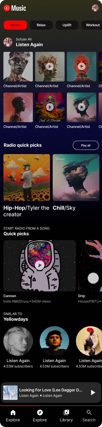
When I started this redesign, I wanted to make YouTube Music feel easier to use and more personal. I noticed the current app can feel a little busy, so my goal was to create a cleaner layout that highlights what matters most, finding the right music fast.

I added mood-based tabs like Relax, Uplift, and Workout so listeners can jump right into music that matches how they’re feeling. I also simplified the “Quick Picks” and radio sections to make them more inviting and less overwhelming. Throughout the process, I kept testing different layouts and flows, focusing on how the design could feel intuitive but still engaging.

Overall, this concept is about creating a music experience that feels familiar, but also more enjoyable and user-friendly.

Concept Designs

YouTube Music Concept design

Concept Designs

Bath & Body Works

Project: Bath & Body Works App – Concept Redesign This redesign focuses on improving accessibility and user experience while staying true to the brand’s identity. I simplified the layout, used high-contrast colors, and chose clear, readable fonts to enhance visual clarity. Key features like mood-based product discovery, scent filters, and streamlined navigation were added to make the app more intuitive and inclusive for all users.

Project: My Journal – Mood-Based Memory App Interface This concept app blends journaling, mood tracking, and visual storytelling to help users reflect on thoughts and memories in a personal, immersive space. I designed both light and dark modes to support accessibility and comfortable reading in any environment. The clean layout and calming visuals promote mindfulness while keeping navigation simple and intuitive.